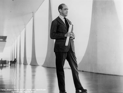
His life and
his architectural revolution is a real inspiration for me, also his use of
colors, his coloring style is mainly minimalistic, because of the use of white
but he always spice it up with a touch of other colors that create a great
contrast with the white and with the context of the building, here are some
examples.
- This great building is The Cathedral of Brasília (Catedral Metropolitana Nossa Senhora Aparecida) is the Roman Catholiccatedral serving Brasilia, Brazil, and serves as the seat of the Archdiocese of Brasilia. It was designed by Oscar Niemeyer, and was completed and dedicated on May 31, 1970. The cathedral is ahyperboloid structure constructed from 16 concrete columns, weighing 90 tons each. The use of color here is awesome, how I said before he uses colors to contrast with the white and the environment, the color here it also gives the sealing a divine quality because the uses of blue is similar to the colors of the sky and heaven
2. The same happens here in the Iberapuera auditorium in Sao Paulo,
Brazil. He uses the strong quality of red to make the entrance of the building
pop up, to give it relevance as a contrast to the white straight lines.
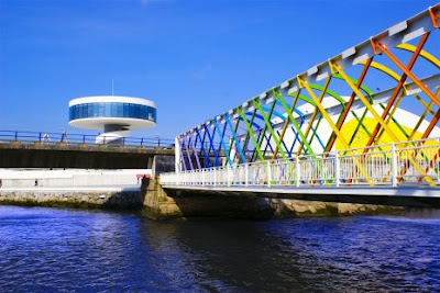
3. This proyect is
the International Cultural Centre (popularly known as El
Niemeyer), is a cultural centre of international significance located in
Aviles, Asturias (Spain). The architect described the Niemeyer Centre
as "An open square to the humankind, a place for education,
culture and peace". It is possible to see the complex from
different places, even from the air. Its size and white and yellow colours
highlight its location in the landscape of the town. This proyect is huge and i
love the fact that the most important parts of the construction are the only
ones that are colored, it's a way of pointing out the important using color.
Also i love the fact that even tho he always uses bright colors they don't look
like 'too much' is really well balanced.
This is another view of the Niemeyer Centre. In there I think the pink
works perfecly and gives such a lovely contrast with the blue of the beach and
all the environment, and it does such a great work pointing out the long
entrance like that, it really creates a nice walk, a place where you can stay
for a while instead of just being a 'passing through'


No comments:
Post a Comment